Recently, I’ve been seeing more and more CSS-related posts talking about how “the way line breaks look can change quite dramatically.”
I’ve always been the type of person who is very particular about where lines break and how line endings look. Even when the content itself is good, I’ve often felt that readability drops if a heading wraps awkwardly or a paragraph line becomes too long.
Up to now, I often adjusted the appearance on a case-by-case basis by slightly tweaking things like font-size or subtly changing letter-spacing.
That approach is convenient, but once those adjustments start increasing page by page, it becomes easy for management and consistency to get scattered.
So this time, I tried applying some CSS experimentally, and one clear change stood out.
It was the way body text wrapped.
Previously, a line could break in awkward places, such as splitting at the end of a phrase, which sometimes resulted in line breaks that felt slightly unnatural in Japanese typography.
However, when I applied text-wrap: pretty, I started seeing more cases where the line breaks felt more natural and better preserved the flow of the sentence.
Before
After
After seeing that change, I felt that “this might be something that can be improved through base design rather than individual tweaks,” which led me to examine this CSS approach more seriously.
What I focused on this time was the idea of improving the way line breaks themselves are chosen on the CSS side.
In this article, I’ll sort through recently popular properties such as text-wrap: balance, text-wrap: pretty, word-break: auto-phrase, and max-width: ○○ch, while separating what is genuinely true from what tends to be slightly overstated, and summarize what seems realistic when introducing them to a WordPress site.
Are Those Recently Popular “Perfect Line Break” Posts Actually True?
On social media, I often see statements like “In 2026, perfect line breaks can be achieved with CSS alone.” It is true that the range of what can be improved has expanded significantly compared to before, but in reality, these properties do not work the same way in every browser.
Also, the properties that work well for headings and those that work well for body text are a little different. On top of that, Japanese has the issue of unnatural wrapping in the middle of phrases, so taking English-language explanations at face value can sometimes lead to a mismatch.
In other words, this topic is not just a small CSS trick. It is really about how to design readability.
The Conclusion First: A Practical Way to Use These in 2026
To give the conclusion upfront, the following way of thinking is very practical in real-world work.
| Target | Recommended | How to Think About It |
|---|---|---|
| Headings | text-wrap: balance | Helps make multi-line headings look more even |
| Body text | text-wrap: pretty | Makes it easier to avoid awkward short last lines |
| Japanese headings | word-break: auto-phrase | Can aim for more natural phrase-based wrapping in supported browsers |
| Overall body width | max-width: 〇〇ch | Prevents lines from getting too long and builds the foundation for readability |
The key point is not to apply everything at once. It is safer to test things gradually: first headings, then body text, and finally fine-tuned adjustments for Japanese typography.
The Traditional Adjustment Method and Its Limits
What I had often done before looked something like this.
- If a heading wrapped poorly, I would slightly reduce the font-size
- If the text looked too cramped, I would slightly increase letter-spacing
- If only a specific page felt hard to read, I would add CSS only to that page
Of course, there is nothing inherently wrong with this kind of fine-tuning. In fact, it is still necessary in some local situations. However, this approach is fundamentally about fixing whatever looks off each time.
As the number of pages grows, the drawback is that it becomes harder to keep track of what was adjusted and where. This is especially true in WordPress, where you may have static pages, blog posts, landing pages, and service pages all with different characteristics. Once page-specific optimization accumulates, it becomes harder to refine the site as a whole later on.
That is why this CSS approach is attractive: it can move you toward typography design that is less likely to break from the start.
A Good Approach: Testing It Selectively with Simple Code Inserter
With CSS like this, it is safer not to apply it to the entire site all at once, but instead to test it only on specific pages or posts first.
For that purpose, I use my own plugin called Simple Code Inserter. It is a very simple plugin that lets me add code to wp_head or wp_footer on a per-page or per-post basis.

There are other similar plugins, but during testing, I find it easier to work with something that has as few extra features as possible, so I keep my own setup minimal.
This approach also fits the current topic very well: test it only on part of the site first. For example, try it only on headings, or only on service pages. It is easy to verify in small units like that.
What Does text-wrap: balance Actually Do?
text-wrap: balance is a property that chooses line break positions in a way that tries to make the lengths of lines in a multi-line heading as even as possible.
For example, in a two-line or three-line heading, if only the first line is long and the second line is extremely short, the result often looks unbalanced. When you use balance, it becomes easier to achieve a cleaner, more heading-like line wrap.
This is especially effective in situations like the following.
- Blog post titles
- Main headings on service pages
- Headings inside card-based UI
- Subheadings that wrap to two or more lines on smartphones
On the other hand, if you apply balance to long body paragraphs, the visible text block may look narrower overall or feel unnatural. For that reason, it is generally safest to think of it as primarily for headings.
How Should text-wrap: pretty Be Used for Body Text?
text-wrap: pretty is a property that chooses line breaks while prioritizing visual quality over rendering speed.
In body text, you often get situations where the final line of a paragraph becomes extremely short. Those isolated short last lines can feel slightly awkward to read. Pretty can sometimes help reduce that kind of discomfort.
That said, a little caution is needed here. Pretty is an area where browser differences can show up rather easily. In one browser, the change may be subtle, while in another, the line breaks across an entire paragraph may shift more noticeably.
Because of that, when using it for body text, it is safer not to apply it to every paragraph all at once, but to first check it on pages with longer article content.
How Does word-break: auto-phrase Work for Japanese?
Of all the properties discussed here, the one that may be especially interesting for Japanese site owners is word-break: auto-phrase.
In supported browsers, it aims to wrap text by prioritizing natural phrase boundaries in Japanese. Since Japanese does not use spaces between words the way English does, normal line wrapping can sometimes break a line in the middle of a phrase in an awkward way.
When this property works well, it can make short headings and catchphrases behave more like “Yes, that is exactly where I wanted the line to break.”
However, this is not universally supported across all browsers either. So at the moment, the realistic mindset is not “lucky if it works,” but rather “it provides improvements in browsers that support it”.
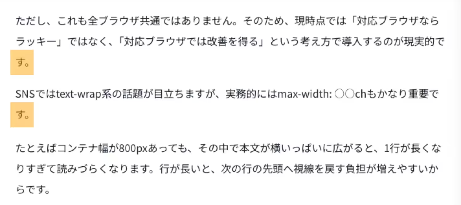
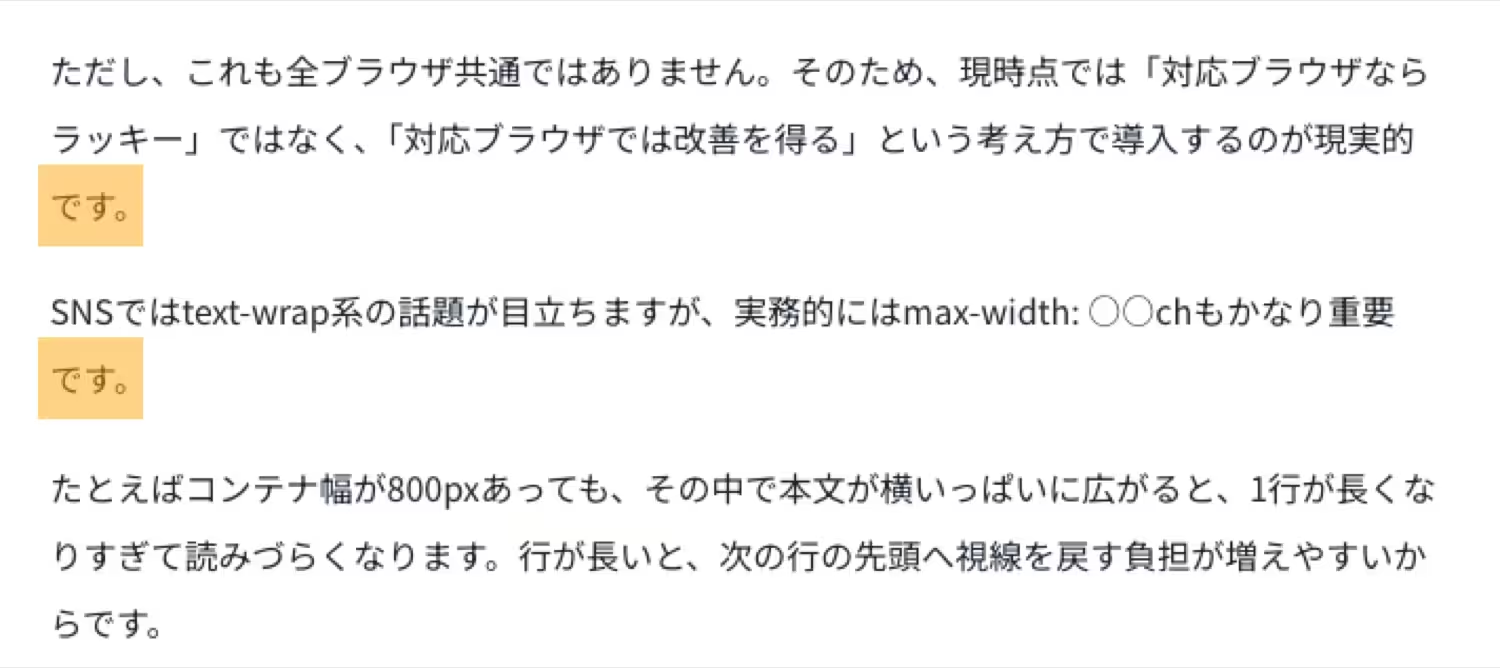
max-width: ○○ch Is Actually Very Important
On social media, text-wrap properties get most of the attention, but in real work, max-width: ○○ch is also extremely important.
For example, even if a container is 800px wide, if body text stretches fully across that space, each line can become too long and harder to read. When a line gets too long, it becomes more tiring for the eye to return to the beginning of the next line.
By limiting the maximum width of body text to around 60ch to 70ch, it becomes easier to create a readable line length that does not spread too far horizontally. In other words, readability is not built only by text-wrap properties, but also by not letting lines get too long in the first place.
From my own experience as well, if you are trying to fix awkward line breaks, adjusting font-size and letter-spacing over and over is less stable than first organizing the line length itself.
Fact-Checking Claims That Spread Easily on Social Media
“Perfect line breaks can be achieved with CSS alone”
This is a bit of an overstatement. It is true that things can be improved far more than before, but because of browser differences and Japanese-specific typography issues, it will not always become “perfect” in every environment.
“Use balance for headings and pretty for body text”
This is a very practical way to organize the idea. However, because pretty behaves differently depending on the browser, it is safer to verify it page by page rather than apply it site-wide without checking.
“auto-phrase lets you wrap perfectly at every phrase boundary”
This is a potentially misleading expression. It is certainly a promising feature, but browser support is still limited at this stage, so it cannot yet be described as always perfect.
“A 1px adjustment can dramatically change UX”
This is half true and half easily overstated. Readability does improve through accumulation of small details. However, whether the effect is truly dramatic depends on the overall design, including font choice, line height, line length, heading structure, and whitespace.
If You Want to Introduce This to a WordPress Site, Where Should You Start?
My recommendation is to proceed in the following order.
- Start with text-wrap: balance on headings
- Then apply text-wrap: pretty selectively to body text
- Introduce auto-phrase gradually for Japanese headings
- Reconsider body width using ch units
In this order, the visual changes are easy to understand and the risk of trouble stays low. If you apply everything to all headings and all body text at once, it becomes harder to tell which property is doing what.
Also, because WordPress themes and existing CSS can affect the results, it is best to test it only on specific templates or articles at first.
The Smallest CSS Setup Worth Testing First
It is easiest to start with a minimal setup like this.
@supports (text-wrap: balance) {
  h1, h2, h3, h4, h5, h6 {
    text-wrap: balance;
  }
}

@supports (text-wrap: pretty) {
  p, li, blockquote {
    text-wrap: pretty;
  }
}
Even with just this, supported browsers can make headings and body text look slightly more refined. In unsupported browsers, the declarations are simply ignored, which is another reason why this is easy to introduce gradually.
If You Want to Test Something for Japanese, Try This
If you want to experiment further with Japanese headings, something like this can also work.
@supports (word-break: auto-phrase) {
  :lang(ja) h1,
  :lang(ja) h2,
  :lang(ja) h3,
  :lang(ja) h4,
  :lang(ja) h5,
  :lang(ja) h6 {
    word-break: auto-phrase;
  }
}
The important point here is the mindset: if it does not work, the layout does not break; supported browsers simply gain an improvement. So for now, it makes sense to use this as a base and add individual fine-tuning only where needed.
An Example That Also Improves Body Width
If you want to improve readability at the body-text level as well, this kind of rule pairs nicely with the above.
.entry-content,
.wp-block-post-content {
  max-inline-size: min(68ch, 100%);
  margin-inline: auto;
}
Even this alone makes it easier to prevent body text from becoming too wide. In other words, this topic is not simply about “making line breaks beautiful,” but about placing text inside a container that is easier to read.
The Application Policy I Would Recommend for My Own Site
If I were introducing this gradually on my own WordPress site, I would proceed like this.
| Area | How I’d Apply It | Reason |
|---|---|---|
| Post titles and H2 headings | balance | It is the easiest place to confirm the effect |
| Body text in long-form articles | pretty | It can reduce awkward short final lines |
| Short Japanese catchphrases | auto-phrase | It may allow more natural phrase-based wrapping |
| Body text overall | max-width: around 60–70ch | It creates the foundation for better line length |
How Each Property Behaves When Applied
You can check the differences in line wrapping by resizing the width of your desktop browser.
No property applied
This is a line-break test. This is a line-break test. This is a line-break test. This is a line-break test. This is a line-break test. This is a line-break test. This is a line-break test. This is a line-break test.
text-wrap: balance
This is a line-break test. This is a line-break test. This is a line-break test. This is a line-break test. This is a line-break test. This is a line-break test. This is a line-break test. This is a line-break test.
text-wrap: pretty
This is a line-break test. This is a line-break test. This is a line-break test. This is a line-break test. This is a line-break test. This is a line-break test. This is a line-break test. This is a line-break test.
word-break: auto-phrase
This is a line-break test. This is a line-break test. This is a line-break test. This is a line-break test. This is a line-break test. This is a line-break test. This is a line-break test. This is a line-break test.
max-width: 65ch
This is a line-break test. This is a line-break test. This is a line-break test. This is a line-break test. This is a line-break test. This is a line-break test. This is a line-break test. This is a line-break test.
The First Thing I’d Test Is balance
Especially on service pages and landing pages, the impression made by a heading that wraps to two lines is very important. In that sense, the clearest first step is to apply balance to titles and headings.
Original title wrapping
Applying text-wrap: balance to the title

A Caution: Overdoing It Can Hurt Readability
This is an important point. These properties are useful, but more is not always better.
- Applying balance to body text and making it feel unnatural
- Reducing line length too much and making the layout feel cramped
- Conflicts with existing theme CSS
- Applying everything site-wide without checking browser differences
All of these can happen very easily. That is why it is so important to test things in a limited way first. In situations like this, I prefer using a simple setup such as Simple Code Inserter to apply the CSS only to a few pages first, then check how it looks on both smartphones and desktop before expanding it further.
The Most Important Thing I Want to Convey in This Article
The biggest point in this discussion is that it allows you to shift your thinking from “fix whatever looks off each time” to “design things so they are less likely to break from the start”.
Until now, I often adjusted font-size and letter-spacing in detail just to make one page look right. That is still sometimes necessary, of course. But if you use CSS like this well, it becomes easier to improve the way line breaks themselves are chosen, which can reduce the need for repeated stopgap fixes.
In that sense, this CSS is not just a small trick. I think it is a very interesting opportunity to reconsider the overall readability design of a WordPress site.
Summary
To wrap up, here are the key takeaways.
- text-wrap: balance is easy to start testing on headings
- text-wrap: pretty works well as a gradual addition to body text
- auto-phrase is attractive for Japanese headings, but browser support should be checked
- max-width: ○○ch is extremely important as the foundation of readability
- It becomes easier to manage the site when you shift from local adjustments to design-level improvement
Personally, I have often adjusted font-size and letter-spacing little by little whenever I noticed something awkward. But after learning about CSS like this, I feel that it may be possible to create readability more effectively at the base design level.
On a WordPress site, it would be interesting to start by applying this only to a few pages and then checking how the impression of headings and body text changes. By testing in small steps, you can gradually raise the overall readability of the site.